Yes – we know it’s not the traditional time of year to forecast trends, but at PLN Group we like to do things differently. To be fair it is officially the Maori New Year, with Matariki having just passed. Plus, this year we are anticipating that the trends will be far longer lasting than the usual 12 months or so.
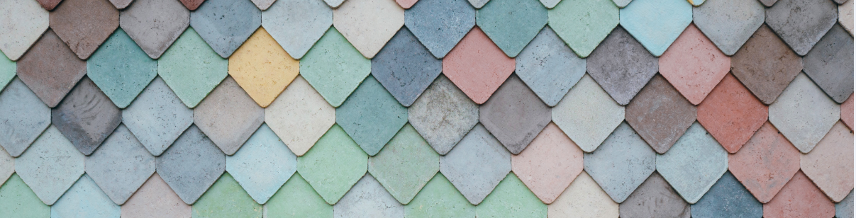
If you look hard enough in colour-trend articles you could probably confirm pretty much any colour scheme your heart desires. But our forecast for the coming months and well beyond is a continuation of love for earthy, naturalistic tones, but with brighter splashes of contrast – especially pinks, oranges and metallics – although even those will tend towards the dusky or burnished rather than bright.
Pantone’s colour of the year, Viva Magenta is a case in point. A deep natural pinky-red (or reddy-pink) that could easily be spotted in the natural world and "exudes a feeling of energy and vibrancy".
Credit: Pantone
Granny Is Right
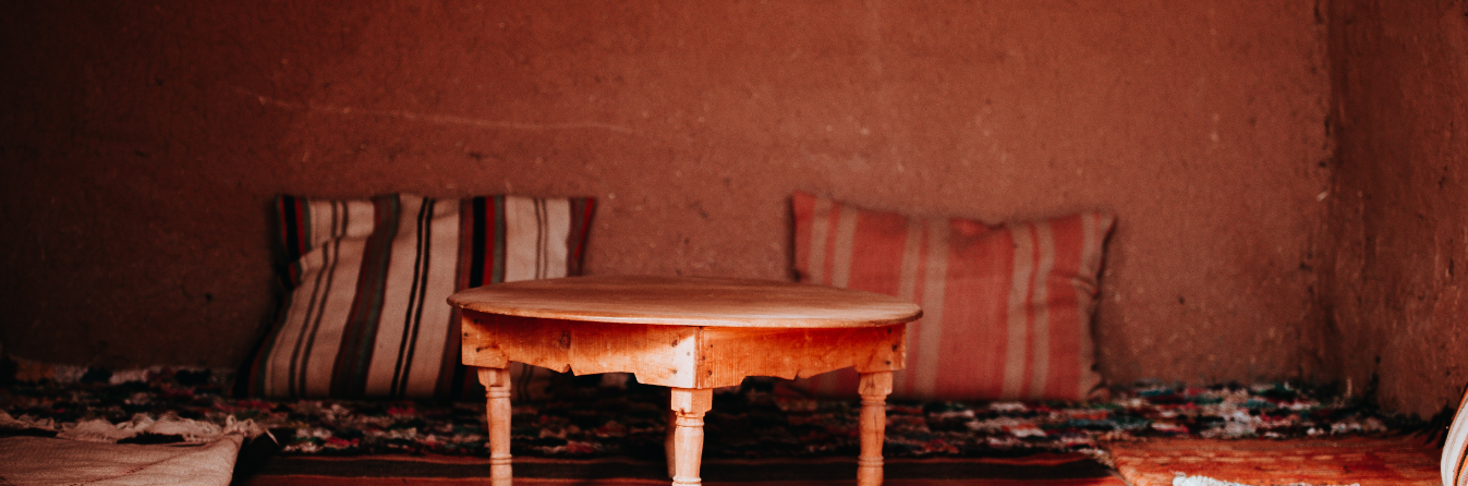
Whilst we’re on the warmer end of the spectrum, violet and lavender may be making a comeback. We’ve not seen much of them yet, but the colours reminding us of all our Grannies pop up in many-an-article about trends, so keep an eye out.
Credit: Grey, Ridley, Levis - Unsplash
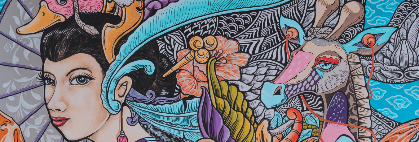
Nature Inspired
Biophilic design is driving some of the naturalistic approach to colour – the design articulation of the innate human connection to the natural world. We firmly believe biophilic design is here to stay, hence the assertion of longer-lasting colour fashions. But there’s also evidence that we tend towards those earthier colours when times are tough – and for many people around the world, times are very trying at the moment. We want to hunker down. Provide a cosy, safe, natural environment for ourselves and our loved ones. Revert to nature – where our brains still reside.
We anticipate a wide palette of colours will be used, but they will all tend towards the subtle rather than the brash.
Rethink Neutrals
Think 1930’s hues, heritage colours, but perhaps with a modern take: dusty greens, soft sage, or deeper emeralds. But keep an eye out for increasing amounts of saturation in the greens we see. They’ll remain earthy but will pack more of a punch as economies pick up and positivity returns.
In terms of neutrals, these will still abound. They will remain warm but there’s a good chance our long-lived love affair with grey will be tested by that most contentious of colours (although not technically a colour at all), brown. Let’s face it, if you want earthy, then brown is it. Warm chocolates may dominate but expect to see all shades helping connect us to the natural world and remain grounded.
Credit: Annie Spratt
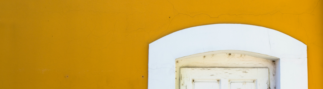
Sky Colours
Yellows will be sunny, but not dayglo sunny. There will be more orange warmth in the yellows we see, and some will even veer towards cinnamons or mustards, bringing in those browns mentioned earlier.
Credit: Vilmos Heim
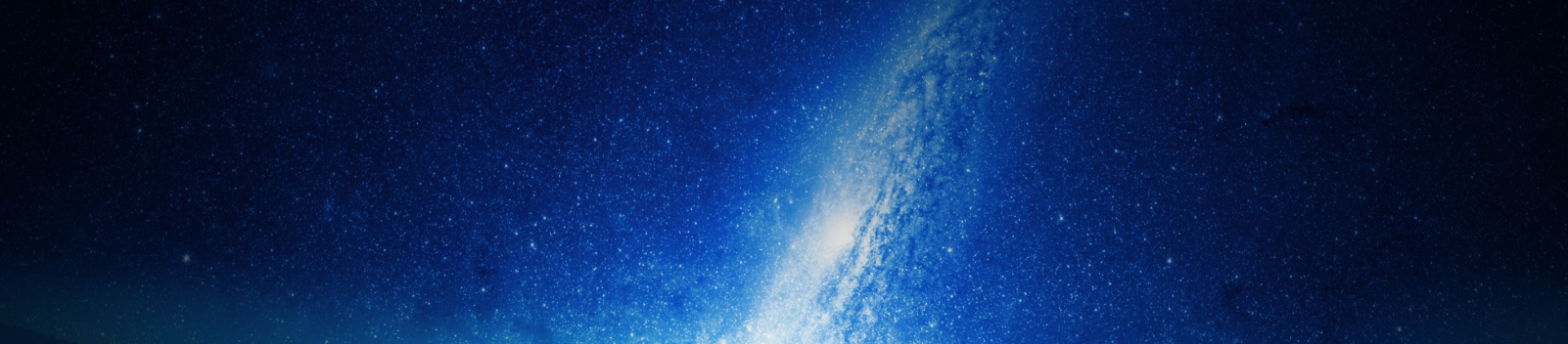
Blues will wane a little but similarly follow the dusky, earthy or maybe powdery route. Think the deep blues of a starry night or maybe a light dusty blue as accent to some of those warmer tones.
Credit: Juskteez Vu
Deco Revival
As an aside, we can see the beginnings of a Deco revival too in the shapes and architecture coming through at the big festivals around the world in Milan, London and New York. If this is a continuing theme then those confident deco colour combos may also become de-rigueur.
So, whatever your colour choices may be, be bold with colour and you’ll be right on trend.