Colour

Colour in The Workplace - How colour can affect mood, creativity, productivity and wellbeing in the spaces you work.

The use of colour in the workplace is evolving. The design of any office or workspace should begin with the premise that a happy and comfortable employee is likely to be more creative and productive than those who are less content.

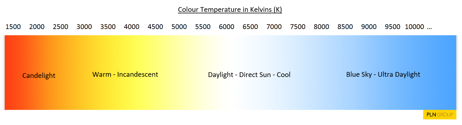
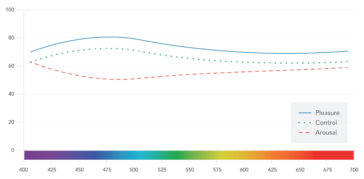
Secondly, as sight is our most sensitive and highly developed sense, it should be recognised that colour is a powerful stimulant and one, it has been proven, can directly affect our mood and thoughts.

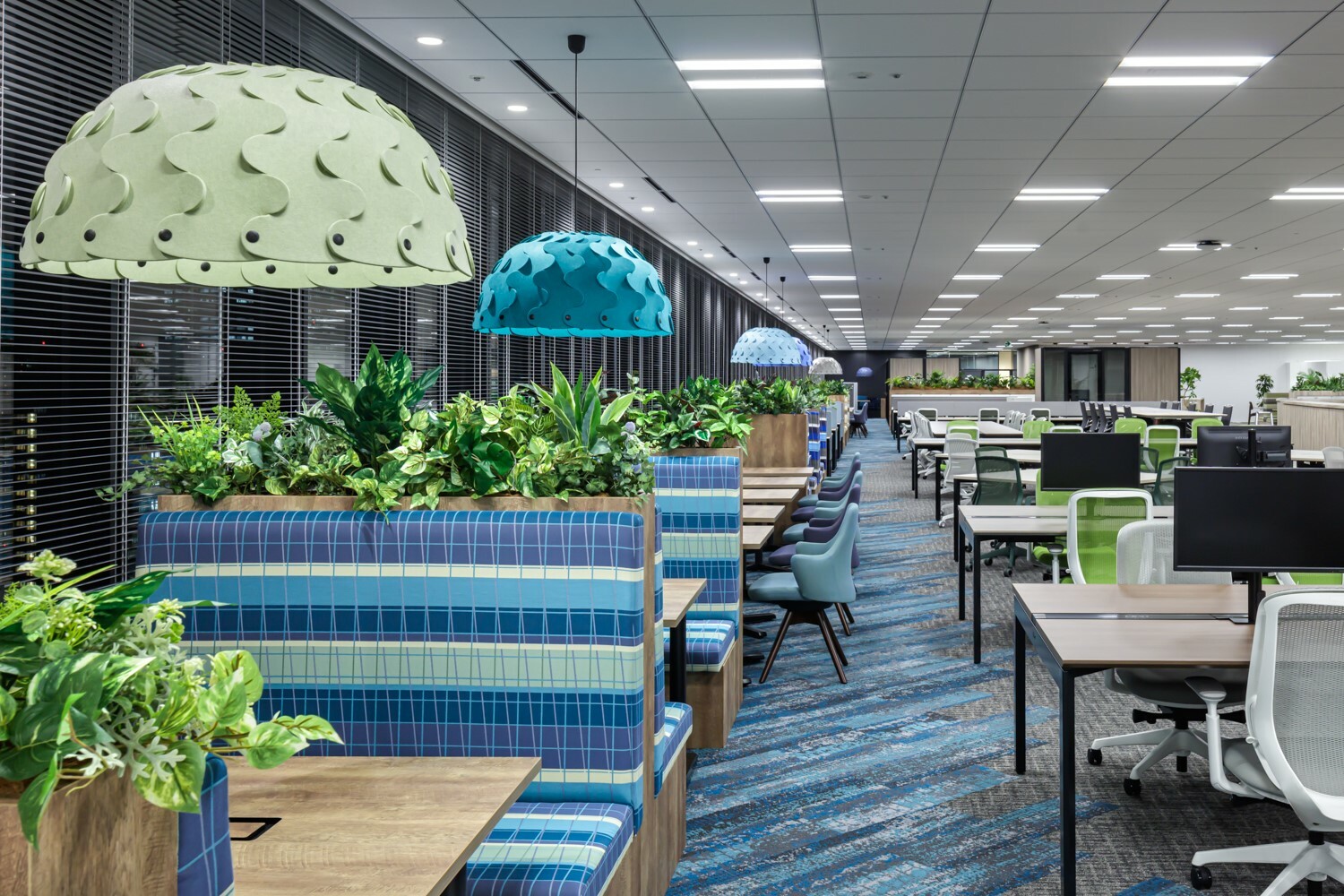
It makes sense then, when designing or redesigning, colour in the workplace should be of prime consideration. But, knowing as we do that different colours can have different effects on people, the secondary consideration should be around how various areas of the workspace will be used and what sort of people will use them. A blanket colour scheme that has blue as its predominant shade is likely to help with productivity and aid quiet and relaxed workers, but if you need dynamism and creativity, then green with yellow, red or orange accents may be better suited: green for creativity and the warmer colours for stimulation.

Colour: The Rules of Engagement

The interior design credo for colour is for a 60-30-10 breakdown. 60% of the space should be your dominant colour with a primary accent colour taking up 30% to create visual interest. The final 10% is a secondary accent, which will probably be far brighter and delivers spark and energy to the space.

But designers also recommend ‘shade layering’ using furniture and floor coverings that are different shades of the main wall colour to provide depth.

Match Colour to Task

Consideration should be given to what sort of tasks will be carried out in different areas of the workspace. For those employees who are task focused, whatever their departmental allegiance, may work more productively in a blue space, whilst the collaborative creatives might prosper more under yellows and greens.

It’s been understood for many years that colour can and will affect mood and more recent studies have demonstrated a link between certain palettes and productivity, creativity, and positivity. Broadly it’s been seen that the following colours and moods go together.

  • Blue – Productivity, Confidence, Focus, Comfort
  • Yellow – Optimism, Creativity, Energy, Attention
  • Red – Urgency, Efficiency, Energy, Stress-inducers, Attention
  • Green – Calm, Alert, Peaceful, Optimistic
  • White – Clean, Modern, Open
  • Orange – Friendly, Cheerful, Successful, Attention
  • Purple – Luxury, Wisdom, Loyalty
  • Black – Control, Stability, Intellect

Key Colours

Blues and greens are both biophilically aligned to that innate human desire to retain links to nature.

Blues

Blue is consistently the world’s favourite colour, maybe because it’s so prevalent in nature, above us and in large bodies of water. And while many believe blue to be a relaxing colour, a lot depends on the colour temperature. Blues in the higher kelvin colour temperature zones (full daylight) can actually help people feel less sleepy and more focused – no doubt an evolutionary throwback to when our ancestors had to be fully on their game in the daylight hours. Whereas lower down the scale it can be a cold colour and thus uncomfortable for longer periods of time.

colour temperature

Greens

But green is the colour we feel most comfortable with. It’s a colour that doesn’t tire our eyes (avoid the more vivid shades though) and can help calm and soothe. Biologically, our eyes more readily detect the wavelengths where greens sit (around 500 - 550 nanometres), but if you think about our ancestral past – a blink of the eye in evolutionary terms – it makes sense that green means the most to us. Within a landscape that would have been very green it would have been vital that we recognised all shades of green to identify plants that were edible – or more importantly, not - for example. Similarly, the colours of danger such as red and orange – a poisonous berry or fire - are stimulating – getting us ready for action.

Colour light spectrum


Colour in the workplace - Tokyo
The Anomoly that is Brown

If you consider that colour is simply differing wavelengths of light, then why is there no brown in a rainbow? How does brown exist as a colour if it doesn’t exist in the light spectrum? Researching this article showed that there is plenty of healthy academic debate about brown. Some say it is simply dark yellow, others it’s a blend of red and green – although both say this is why we can see it, as the cone receptors in our eyes see the primary colours within what we call brown and interpret them as, well … brown. However, brown on the nanometre spectrum is said to lie in around 600-620nm, which would make it a dark orange. You choose.

Whatever the truth, brown is brown and is an entirely natural colour, or human-mind construct, (whichever you prefer), and as such, can comfortably sit within the biophilic design space. Although more popularly in the form of timber, brown can be a useful anchoring colour when used in floor coverings.

Biophilic Colour

As biophilic design becomes more and more mainstream, the use of naturalistic colours has returned, with shades of blues and greens, of course, as the predominant colours. Green especially has become popular, partly down to companies wishing to align with an eco-conscious world. But, arguably, it is the most natural or biophilic colour too.

Greys can help to brighten other tones and colours and will no doubt still appear in offices, but hopefully less and less or as secondary colours in the future.

But colours across the spectrum, presented in naturalistic shades are becoming far more popular and widely used. Purples and mustard shades in that muted tonal range are calming and redolent of flowers and autumn woodland for example.

Psychology of Colour


In one psychological school of thought, there are three dimensions to emotion: arousal, pleasure and control. Colour can affect these dimensions and has been mapped (Cugelman 2020, based on data from Camgoz 2000)

But using colour to influence psychology is complex because as well as evolutionary impacts there are social and cultural nuances that may come to bear. For instance, whilst red is associated with danger in the west, it’s also the colour of happiness and fortune in China.

So, consideration of colour and precise mood is useful, but should be tempered with a design ethic and a good dose of common sense and taste.

Let Nature Guide You

Whatever colour palette you decide upon, look to nature to decide how much of each colour will work naturally.

Whilst oranges and yellows may help stimulate thought and action, a whole room painted orange is just as likely to cause headaches and stress. Similarly, just a small amount of green or blue, is less likely to have those desired effects of focus or calming. Go for a walk in the countryside, by the coast, in a desert or on a mountain and take your cues from what you see around you.

A new Colour Range for Nectar...Directly from Nature

We are launching a new range of colours for our Nectar Light, taken directly from nature. Landscapes in New Zealand's south to native New Zealand plants and moorlands elsewhere in the world inspired us to broaden the palette for this beautiful light Nectar Lights
Biophilic Colour Swatch
Colour Range from Nature
Talk to us about colour, biophilia, acoustics or whatever you are interested in. We'd love to hear from you. +64 (0)9 828 4274

Some other articles that might interest you...